| example | ||
| lib | ||
| screenshots | ||
| test | ||
| .gitignore | ||
| .metadata | ||
| analysis_options.yaml | ||
| CHANGELOG.md | ||
| LICENSE | ||
| pubspec.yaml | ||
| README.md | ||

UpdatifyWidget is a Flutter widget designed to seamlessly integrate with the Updatify tool. It
allows to display recent updates, announcements, or notifications from projects directly within SaaS
applications. By leveraging the Updatify API, the widget provides a user-friendly interface for
showcasing project updates, enhancing user engagement and communication.
Get started
To start, sign in on updatify.io, create your project, and
copy its project_id from the project settings.
Then add an UpdatifyTrigger, passing the project_id you just copied. It's a
drop-in button that opens the updates popup and shows a "new updates" indicator
when there are posts the user hasn't seen yet, so it slots naturally into an app
bar or toolbar:
import 'package:updatify_flutter/updatify_flutter.dart';

AppBar(
  actions: [
    UpdatifyTrigger(projectId: 'your_project_id'), // the id you copied
  ],
)
That's all you need to ship it. On build it asks the API how many updates exist since the popup was last opened and, if any, shows a pulsing indicator; opening the popup records the time, so the indicator clears once the updates have been seen.
On mobile a bottom sheet often feels more natural than a centered dialog. Set
popupType to switch:
UpdatifyTrigger(
  projectId: 'your_project_id',
  popupType: UpdatifyPopupType.bottomSheet,
)
FlutterFlow
Building with FlutterFlow? See how you can integrate Updatify with your FlutterFlow application in the FlutterFlow integration section below.
Screenshots
| Desktop | Mobile | Bottom sheet |
|---|---|---|
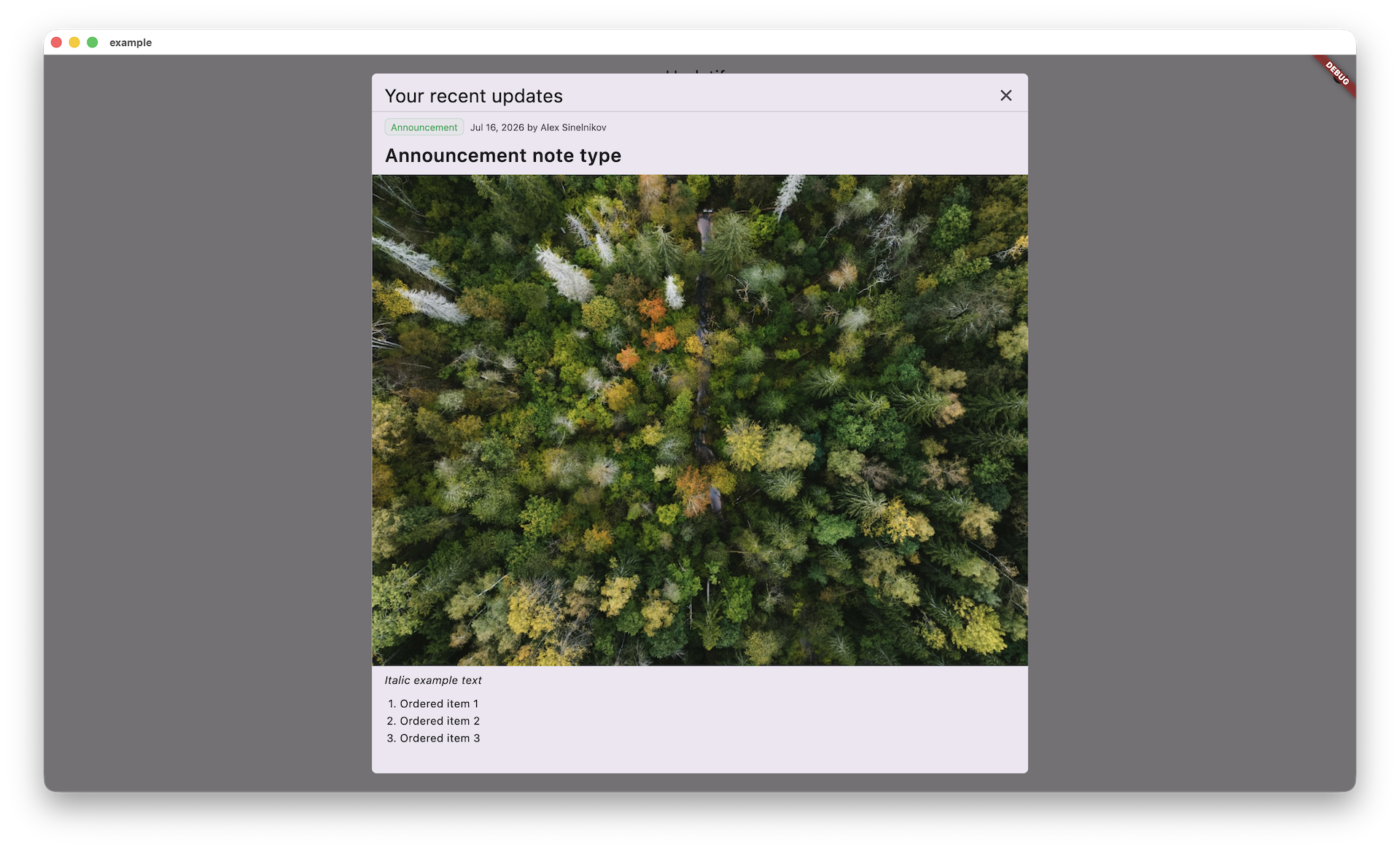 |
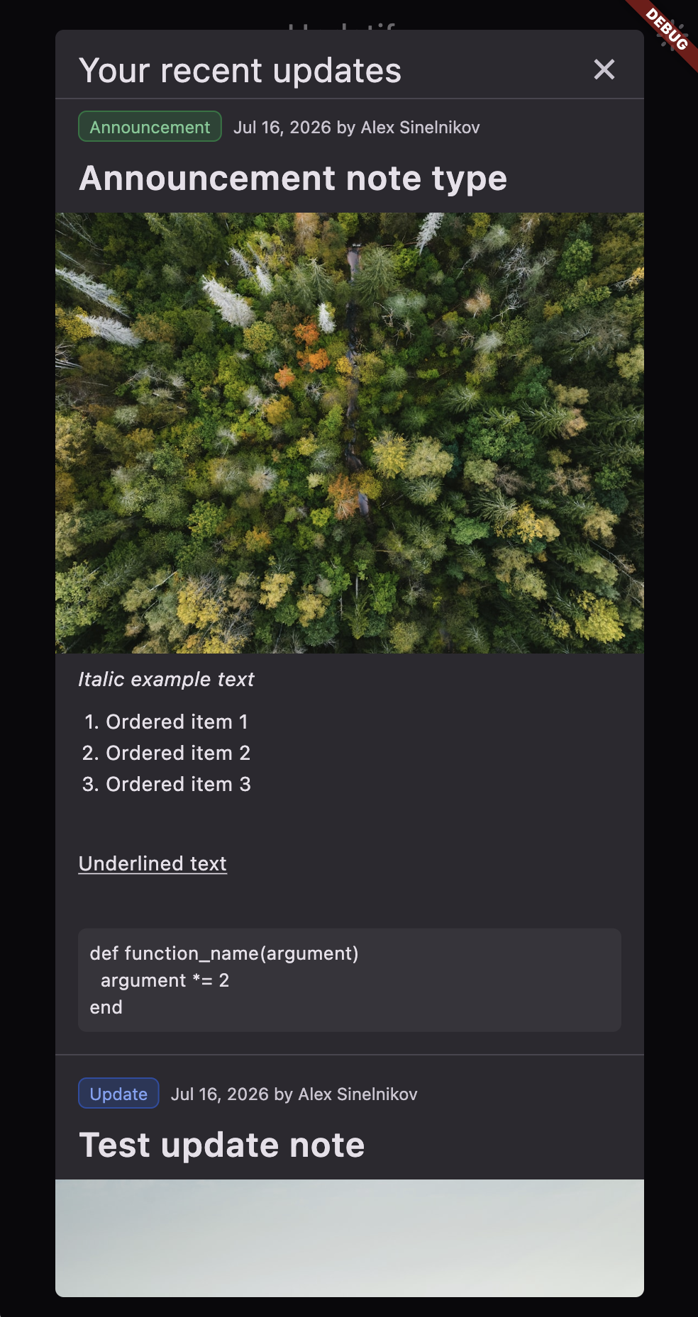 |
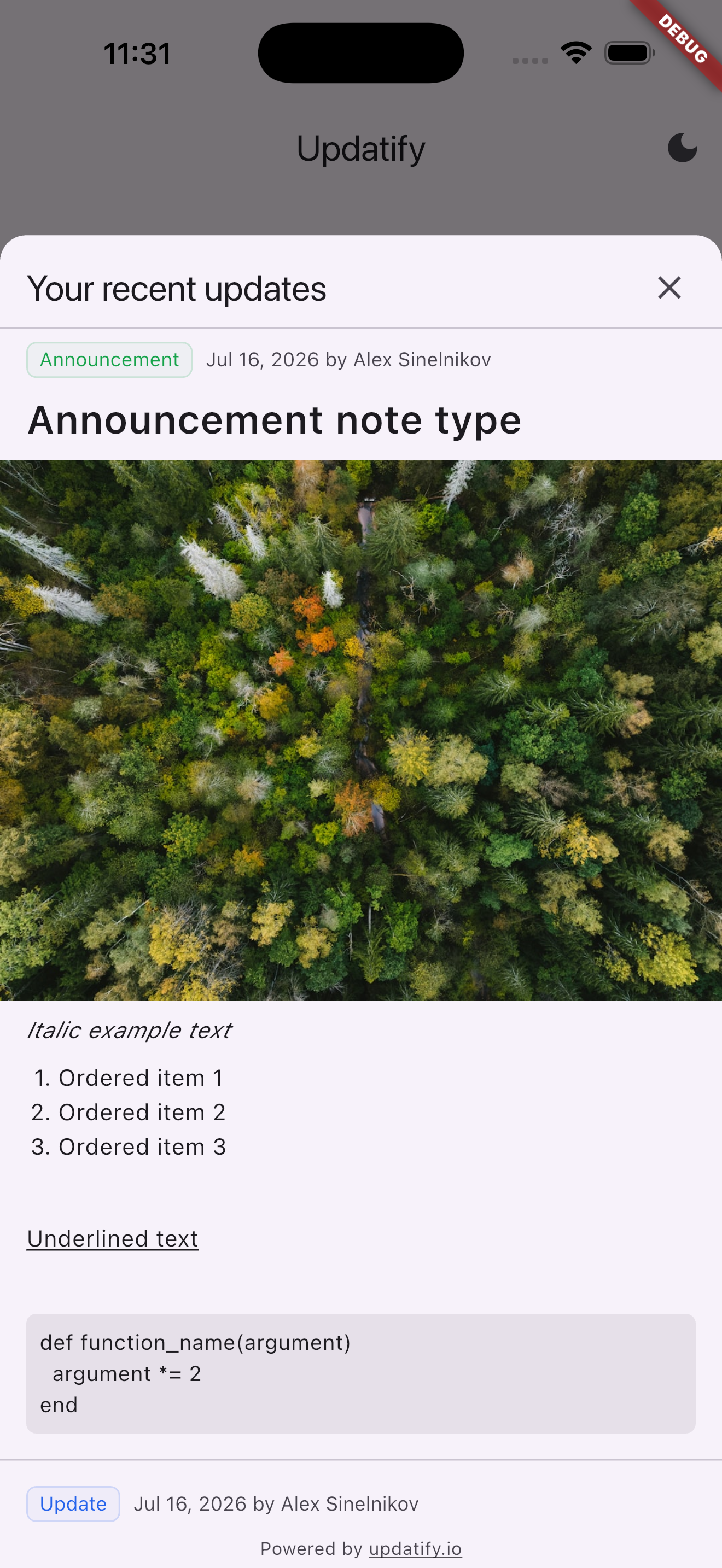 |
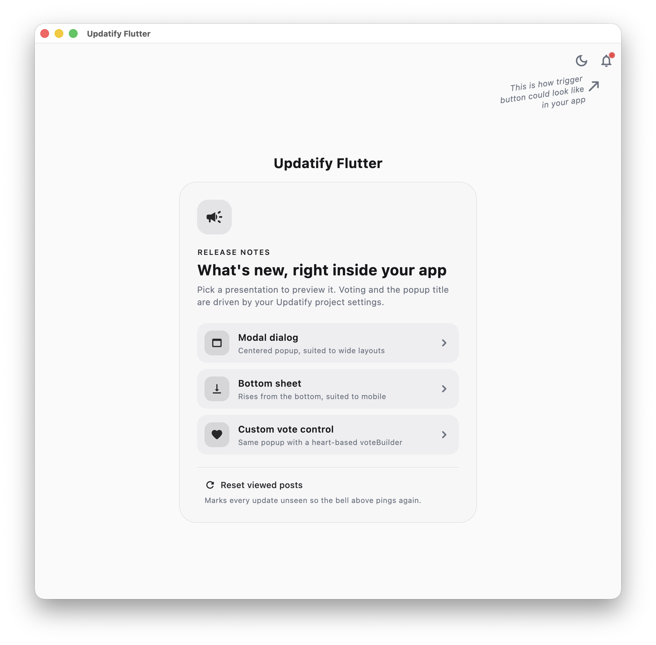
The example app, showing a trigger button wired up in an app bar:
FlutterFlow integration
FlutterFlow can't drop a pub package onto the canvas directly, but it has
first-class support for packages through Custom Code. Since Updatify's main
surface is a single widget (UpdatifyTrigger), the cleanest path is a Custom
Widget that wraps it.
1. Add the dependency
-
Open your project's Custom Code page from the left nav.
-
In the Dependencies panel (pubspec dependencies), add:
updatify_flutter: ^1.4.0 -
Save. FlutterFlow runs
pub geton its build server.
2. Create a Custom Widget
Custom Code → Add → Widget, name it UpdatifyButton, and paste:
// Automatic FlutterFlow imports
import '/flutter_flow/flutter_flow_theme.dart';
import '/flutter_flow/flutter_flow_util.dart';
import '/custom_code/widgets/index.dart';
import '/flutter_flow/custom_functions.dart';
import 'package:flutter/material.dart';
// Begin custom widget code
import 'package:updatify_flutter/updatify_flutter.dart';

class UpdatifyButton extends StatelessWidget {
  const UpdatifyButton({
    super.key,
    this.width,
    this.height,
    required this.projectId,
    this.useBottomSheet = false,
  });

  final double? width;
  final double? height;
  final String projectId;
  final bool useBottomSheet;

  @override
  Widget build(BuildContext context) {
    return UpdatifyTrigger(
      projectId: projectId,
      popupType: useBottomSheet
          ? UpdatifyPopupType.bottomSheet
          : UpdatifyPopupType.modal,
    );
  }
}
width and height are added automatically by FlutterFlow for every custom
widget; leave them in the constructor even though the trigger is icon-sized.
On the editor's right-hand panel, declare the projectId (String, required)
and useBottomSheet (bool) parameters so they're settable from the visual
builder, then Compile.
3. Drop it on a page
UpdatifyButton now appears under Custom in the widget palette. Place it in
an AppBar's actions (or anywhere), and set projectId to the id you copied from
your Updatify project settings.
A few things to keep in mind:
- Custom widgets only run in Test/Run mode or a real build. On the design canvas they render as a placeholder box, so the widget won't hit the Updatify API until you preview or build.
shared_preferencesworks normally in FlutterFlow builds, so the "new updates" indicator and last-viewed tracking behave as expected.- Prefer opening the popup from an existing button's action flow? Wrap
showUpdatifyDialog(...)in a Custom Action instead of a widget.
Customization
Trigger button
UpdatifyTrigger accepts every showUpdatifyDialog customization
(borderRadius, width, title, itemDecoration, …) and forwards them to the
popup it opens.
By default it renders a bell IconButton with a red ping. Supply a builder to
render your own control and place the indicator however you like:
UpdatifyTrigger(
  projectId: projectId,
  borderRadius: BorderRadius.circular(8),
  builder: (context, hasNewUpdates, openUpdates) => IconButton(
    onPressed: openUpdates,
    icon: Badge(
      isLabelVisible: hasNewUpdates,
      child: const Icon(Icons.notifications_outlined),
    ),
  ),
)
| Parameter | Effect |
|---|---|
builder |
Renders the control from (context, hasNewUpdates, openUpdates). Defaults to a bell icon with a ping. |
checkInterval |
How often to re-check for new releases while mounted, so the ping appears without a restart. Defaults to null (check once per mount). |
pingColor |
Color of the default ping. A PingColor preset (red, yellow, green, blue) or any custom Color. Defaults to PingColor.red. |
popupType |
Whether tapping opens a modal dialog (UpdatifyPopupType.modal, the default) or a bottom sheet (UpdatifyPopupType.bottomSheet, better on mobile). |
alwaysShowIndicator |
Forces the indicator on regardless of unseen updates. Useful for previewing. |
useRootNavigator |
Whether the popup is pushed onto the root navigator, covering the whole app rather than an enclosing nested navigator. Defaults to true. |
| (dialog options) | All showUpdatifyDialog parameters below are accepted and forwarded. |
By default the trigger checks for unseen updates when it mounts, so a release
published mid-session only lights the ping on the next app start. Pass
checkInterval to keep checking while the app runs:
UpdatifyTrigger(
  projectId: projectId,
  checkInterval: const Duration(hours: 1),
)
Checks pause while the app is backgrounded and stop once the ping is lit.
To mark updates as unseen again (e.g. in tests or demos), call
UpdatifyTrigger.resetLastViewed(projectId), then rebuild the trigger.
Manual trigger
To open the dialog yourself, for example from an existing button, call
showUpdatifyDialog:
import 'package:updatify_flutter/updatify_flutter.dart';

void main() {
  const projectId = 'your_project_id'; // Replace with your actual project ID
  runApp(
    MaterialApp(
      home: Scaffold(
        body: Center(
          child: Builder(
            builder: (context) => ElevatedButton(
              onPressed: () => showUpdatifyDialog(context, projectId: projectId),
              child: const Text('Recent updates'),
            )
          ),
        ),
      ),
    ),
  );
}
For a bottom sheet instead, call showUpdatifyBottomSheet with the same
projectId (it adds bottom-sheet options like heightFactor, showDragHandle,
and isScrollControlled):
showUpdatifyBottomSheet(context, projectId: projectId);
Both popups are pushed onto the root navigator, so they cover the whole app even
when opened from inside a nested Navigator (a tab shell or an inner router).
To keep a popup inside the enclosing navigator instead, pass
useRootNavigator: false:
showUpdatifyBottomSheet(context, projectId: projectId, useRootNavigator: false);
Styling
Theming
The widget follows your app's ThemeData. Post title and body text, the
header/meta text, code block backgrounds, the divider between posts, the dialog
surface, and the "Powered by" footer all read from the active ColorScheme, so
they adapt to light and dark mode and to your custom colors automatically. To
recolor them, change your theme; there is nothing Updatify-specific to set.
Two colors are intentionally not theme-derived and have their own overrides:
- Post-type chips use a fixed palette (blue for update, green for
announcement, yellow for bug fix, teal for feature highlight), tinted for light
and dark surfaces. Change them with
chipColors(see Posts below). - The trigger's ping indicator is red. Recolor it with
pingColor(aPingColorpreset or a customColor), or replace the whole control with abuilder(see Trigger button below).
Dialog
UpdatifyTrigger forwards every dialog option, so you style the dialog right on
the button:
UpdatifyTrigger(
  projectId: projectId,
  // Rounded corners; convenience for a RoundedRectangleBorder.
  borderRadius: BorderRadius.circular(20),
  // Or pass a full ShapeBorder via `shape` (takes precedence over borderRadius).
  width: 480,                       // content width; defaults to as wide as allowed
  backgroundColor: Colors.white,
  elevation: 8,
  insetPadding: const EdgeInsets.all(24),
  title: 'What\'s new',
  titleStyle: const TextStyle(fontWeight: FontWeight.bold),
  showCloseButton: true,
  barrierDismissible: true,
)
The same options work on showUpdatifyDialog when you open the dialog yourself.
| Parameter | Effect |
|---|---|
borderRadius |
Rounds the dialog corners. Ignored if shape is set. |
shape |
Full ShapeBorder for the dialog. |
width |
Width of the dialog content. |
backgroundColor, elevation |
Dialog surface color and shadow. |
insetPadding |
Padding between the dialog and the screen edges. |
title, titleStyle, titlePadding, titleDecoration |
The dialog header. Leave title unset to use the project's dashboard title (widget_title), falling back to "Your recent updates". |
showCloseButton, closeButtonColor, closeButtonStyle |
The close button. |
contentPadding, contentMargin |
Spacing around the list of posts. |
useRootNavigator |
Pushes the popup onto the root navigator. Defaults to true. |
Posts
Each post's appearance is controlled by UpdatifyPostDecoration, passed via
itemDecoration to UpdatifyTrigger, showUpdatifyDialog, or UpdatifyWidget:
UpdatifyTrigger(
  projectId: projectId,
  itemDecoration: UpdatifyPostDecoration(
    // Title
    titleStyle: const TextStyle(fontSize: 22, fontWeight: FontWeight.w700),
    titleAlign: TextAlign.start,
    // Body
    bodyStyle: const TextStyle(fontSize: 14, height: 1.4),
    bodyPadding: const EdgeInsets.symmetric(horizontal: 16, vertical: 8),
    // Code (inline + code blocks) - merged onto a monospace default
    codeStyle: const TextStyle(fontSize: 13),
    codeBlockDecoration: BoxDecoration(
      color: Colors.grey.shade100,
      borderRadius: BorderRadius.circular(6),
    ),
    // Blockquotes - defaults to a theme-tinted bar on the leading edge
    blockquoteDecoration: BoxDecoration(
      border: Border(left: BorderSide(color: Colors.grey.shade400, width: 3)),
    ),
    blockquotePadding: const EdgeInsets.fromLTRB(12, 4, 8, 4),
    // Horizontal rules ("---")
    horizontalRuleThickness: 1,
    horizontalRuleColor: Colors.grey.shade300,
    // Type chip ("Update", "Announcement", "Bug Fix", "Feature Highlight")
    chipStyle: const TextStyle(fontWeight: FontWeight.w600),
    chipDecoration: BoxDecoration(
      color: Colors.blue.shade50,
      borderRadius: BorderRadius.circular(6),
    ),
    chipPosition: ChipPosition.leading,
    // Per-type base color - used for the chip text and, tinted, its
    // background/border. Defaults: blue (update), green (announcement),
    // yellow (bugfix), teal (feature highlight).
    chipColors: const {
      PostType.update: Color(0xFF2563EB),
      PostType.announcement: Color(0xFF16A34A),
      PostType.bugfix: Color(0xFFCA8A04),
      PostType.featureHighlight: Color(0xFF0D9488),
    },
    // Header (chip + date/author row)
    headerPadding: const EdgeInsets.all(16),
    // Image
    imagePadding: const EdgeInsets.only(bottom: 12),
    // Date formatting (defaults to DateFormat.yMMMd)
    dateFormatter: (date) => DateFormat.yMMMMd().format(date),
  ),
)
| Group | Fields |
|---|---|
| Title | titleStyle, titleAlign |
| Body | bodyStyle, bodyAlign, bodyPadding |
| Code | codeStyle, codeBlockDecoration |
| Blockquote | blockquoteStyle, blockquoteDecoration, blockquotePadding |
| Horizontal rule | horizontalRuleThickness, horizontalRuleColor |
| Chip | chipStyle, chipDecoration, chipPadding, chipPosition, chipColors |
| Header | headerStyle, headerDecoration, headerPadding, headerHorizontalSpacing, headerVerticalSpacing, headerVerticalDirection |
| Image | imagePadding, imageLoadingBuilder, imageErrorBuilder |
| Date | dateFormatter |
For full control over a post's layout, pass an itemBuilder to the trigger. It
receives the BuildContext and the UpdatifyPost and replaces the default
rendering entirely, so itemDecoration no longer applies to that post:
UpdatifyTrigger(
  projectId: projectId,
  itemBuilder: (context, post) => ListTile(
    leading: const Icon(Icons.campaign_outlined),
    title: Text(post.title),
    subtitle: post.body == null ? null : Text(post.body!),
  ),
)
Each UpdatifyPost exposes id, type (a PostType), title, createdAt,
author, imageUrl, and body, so you can build any layout from its data.
Change the separator drawn between posts with dividerBuilder:
UpdatifyTrigger(
  projectId: projectId,
  dividerBuilder: (context) => const Divider(height: 32, thickness: 0.5),
)
The list's scrolling also forwards through the trigger via controller,
physics, and reverse.
Voting
Each post shows an up/down vote control. A tap records the reaction with the Updatify API and mirrors it locally, so when the popup reopens the viewer's previous choice is highlighted. Voting toggles: tapping the already-active vote clears it, and switching replaces it.
Votes are keyed to the same anonymous, per-install id used for view tracking - there's no login. The local mirror is best-effort convenience; the server is the source of truth, so reinstalling simply lets the viewer vote again.
Voting is turned on or off from the Updatify dashboard (the project's
voting_enabled setting); when it's off, the controls are hidden. There is no
client flag - the server owns this.
Replace the default thumbs control with your own via voteBuilder. It receives
the viewer's currentVote (a VoteType?) and an onVote callback - call
onVote(VoteType.up) / onVote(VoteType.down) and all the toggle, networking,
and persistence logic is handled for you:
UpdatifyTrigger(
  projectId: projectId,
  voteBuilder: (context, currentVote, onVote) => Row(
    mainAxisSize: MainAxisSize.min,
    children: [
      IconButton(
        onPressed: () => onVote(VoteType.up),
        icon: Icon(
          currentVote == VoteType.up
              ? Icons.favorite
              : Icons.favorite_border,
        ),
      ),
      IconButton(
        onPressed: () => onVote(VoteType.down),
        icon: Icon(
          currentVote == VoteType.down
              ? Icons.heart_broken
              : Icons.heart_broken_outlined,
        ),
      ),
    ],
  ),
)
voteBuilder is available on UpdatifyTrigger, showUpdatifyDialog,
showUpdatifyBottomSheet, and UpdatifyWidget. Voting is part of the default
post rendering, so a custom itemBuilder (which replaces that rendering) does
not show it.
Server-driven settings
The updates response carries a small project config (voting toggle, widget
title, auto-show toggle) that the widget applies automatically - no extra call.
If you embed UpdatifyWidget directly and want to read those settings yourself,
pass onConfig; it fires once the posts load with an UpdatifyConfig
(votingEnabled, widgetTitle, autoShowEnabled):
UpdatifyWidget(
  projectId: projectId,
  onConfig: (config) => debugPrint('title: ${config.widgetTitle}'),
)
Popup on launch
To announce a release without waiting for the user to find the trigger, call
maybeShowUpdatifyPopup once after startup:
SchedulerBinding.instance.addPostFrameCallback((_) {
  maybeShowUpdatifyPopup(
    context,
    projectId: projectId,
    popupType: UpdatifyPopupType.bottomSheet,
  );
});
Whether it opens is the dashboard's auto_show_enabled setting, so you can turn
it on for a release without shipping an app update.
It opens only for a device that has already been shown an earlier release, so it
never introduces itself uninvited: someone who has never opened the updates is
left alone. Viewing them through any route (the trigger, a popup, an embedded
UpdatifyWidget) records what was seen, which is what enables the popup for the
next release and stops it repeating what was just read.
It never throws and never blocks: a failed check just returns false, and the
returned future completes as soon as the popup is presented rather than when it
is dismissed. For full control over the popup, gate your own
showUpdatifyDialog/showUpdatifyBottomSheet call on shouldAutoShowUpdatify
instead.
Opening links
Links in post bodies open in the device's default browser via
url_launcher. For this to work in
release builds, the host app must declare the appropriate platform config:
iOS - add to ios/Runner/Info.plist:
<key>LSApplicationQueriesSchemes</key>
<array>
  <string>https</string>
  <string>http</string>
</array>
Android - add to android/app/src/main/AndroidManifest.xml, as a direct
child of the <manifest> element:
<queries>
  <intent>
    <action android:name="android.intent.action.VIEW" />
    <data android:scheme="https" />
  </intent>
</queries>
macOS - the app is sandboxed, so add the network client entitlement to both
macos/Runner/DebugProfile.entitlements and macos/Runner/Release.entitlements:
<key>com.apple.security.network.client</key>
<true/>
Windows, Linux, and web need no additional configuration.
See the url_launcher docs
for details.